Almost one in five Australians (18 per cent) —or about 4.4 million— nominated themselves as having a disability at the last Australian Survey of Disability, Ageing and Carers. Half the Australian population over 65 years of age report a disability (ABS 2019b) and the incidence of disability increases with age reaching 81% of those 85 years and older.
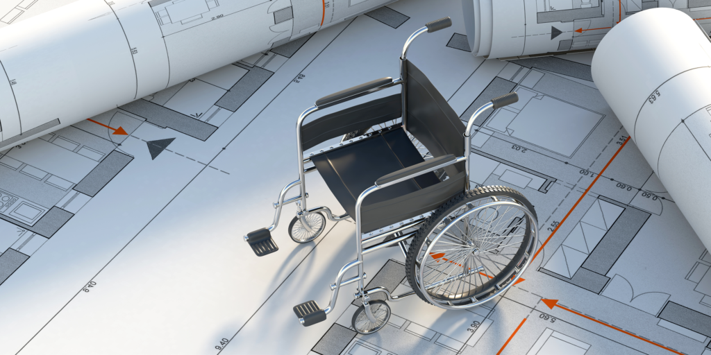
Physical disabilities are the main disability type selfreported making up 85 per cent of people with a disability generally. If those with vision impairment are included, it becomes clear that mobility impairments are a major consideration for those with disabilities in all age groups.
The built environment
There is no getting away from it, people are diverse. Some are left-handed and some right-handed – they vary in ethnicity, culture, their age, size and functional capacities and illness or disability (whether temporary or permanent) can further affect characteristics such as a person’s mobility, dexterity, reach, balance, strength, stamina, sight, hearing, speech, touch, knowledge, understanding, memory, or sense of direction.
People of diverse abilities should, however, be able to use buildings and places comfortably and safely, as far as possible without special assistance. They should be able to find their way easily, understand how to use building facilities such as intercoms or lifts, and know what a pedestrian facility is and where they may encounter traffic.
Given the wide diversity of the population, a universal design approach, that caters for the broadest range of users from the outset, can result in buildings and places that can be used and enjoyed by everyone.
And while the accessibility of recently designed buildings and infrastructure has improved due to changing standards and legislation, the majority of built environment elements pre-date many of the new standards, and while the cost of retrofitting remains a substantial barrier to effective interventions, understanding where and how severe the physical barriers are is an essential component of barrier removal prioritisation.
It is good practice to ascertain the needs of the range of expected users of a property as early as possible, and to check the practicality and usability of design and building implications with a diverse user panel.
Designing for one group can result in solutions that address the needs of many others. For example:
- Level entry (Step-free) entrances facilitate not just wheelchair users but also people with buggies; people with suitcases or shopping trolleys; people using walking or mobility aids; and people with visual difficulties.
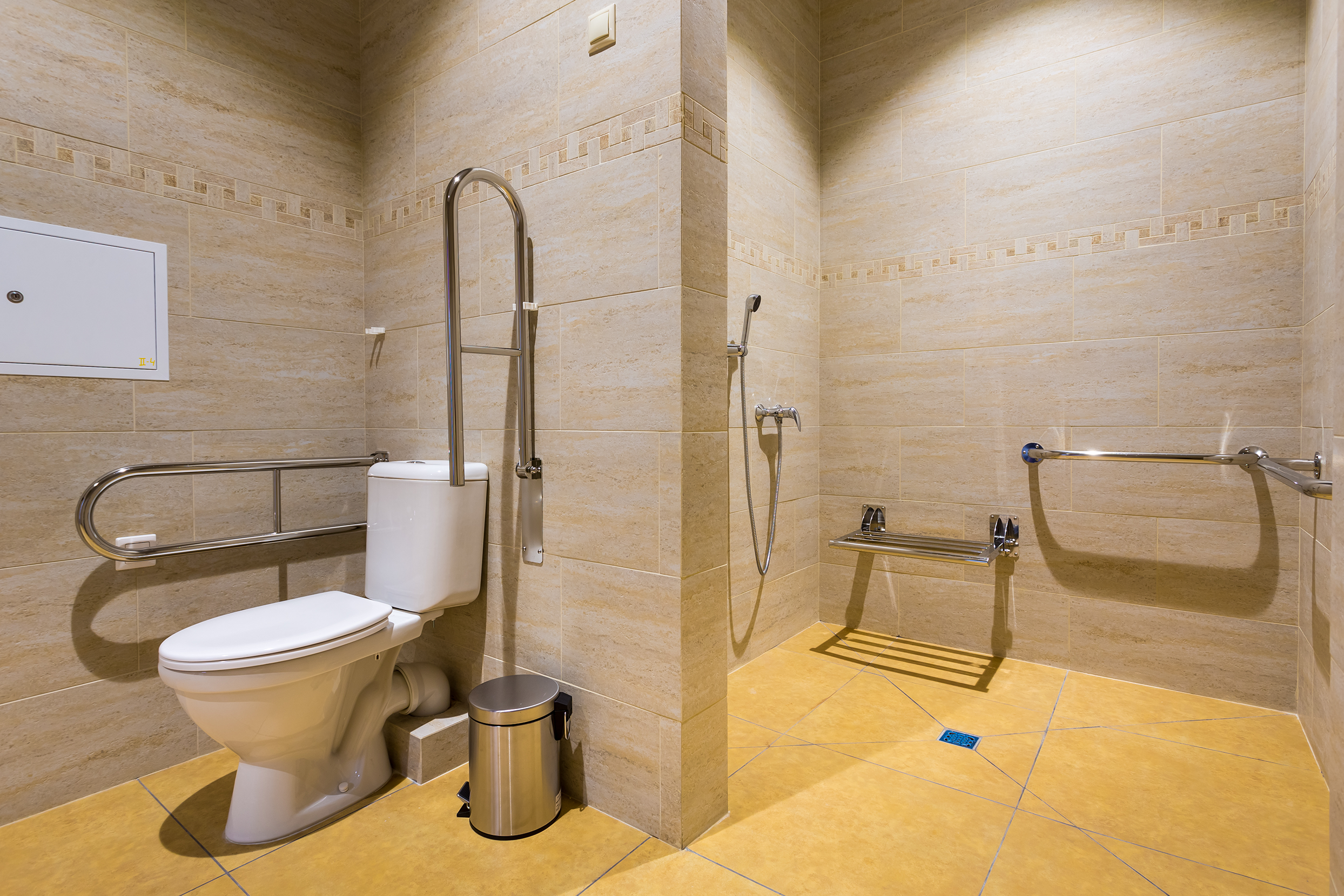
- Larger toilet compartments provide easier access to wheelchair users; those with luggage or parcels; parents with pushchairs or accompanying small children; those using walking or mobility aids; and larger-sized people.
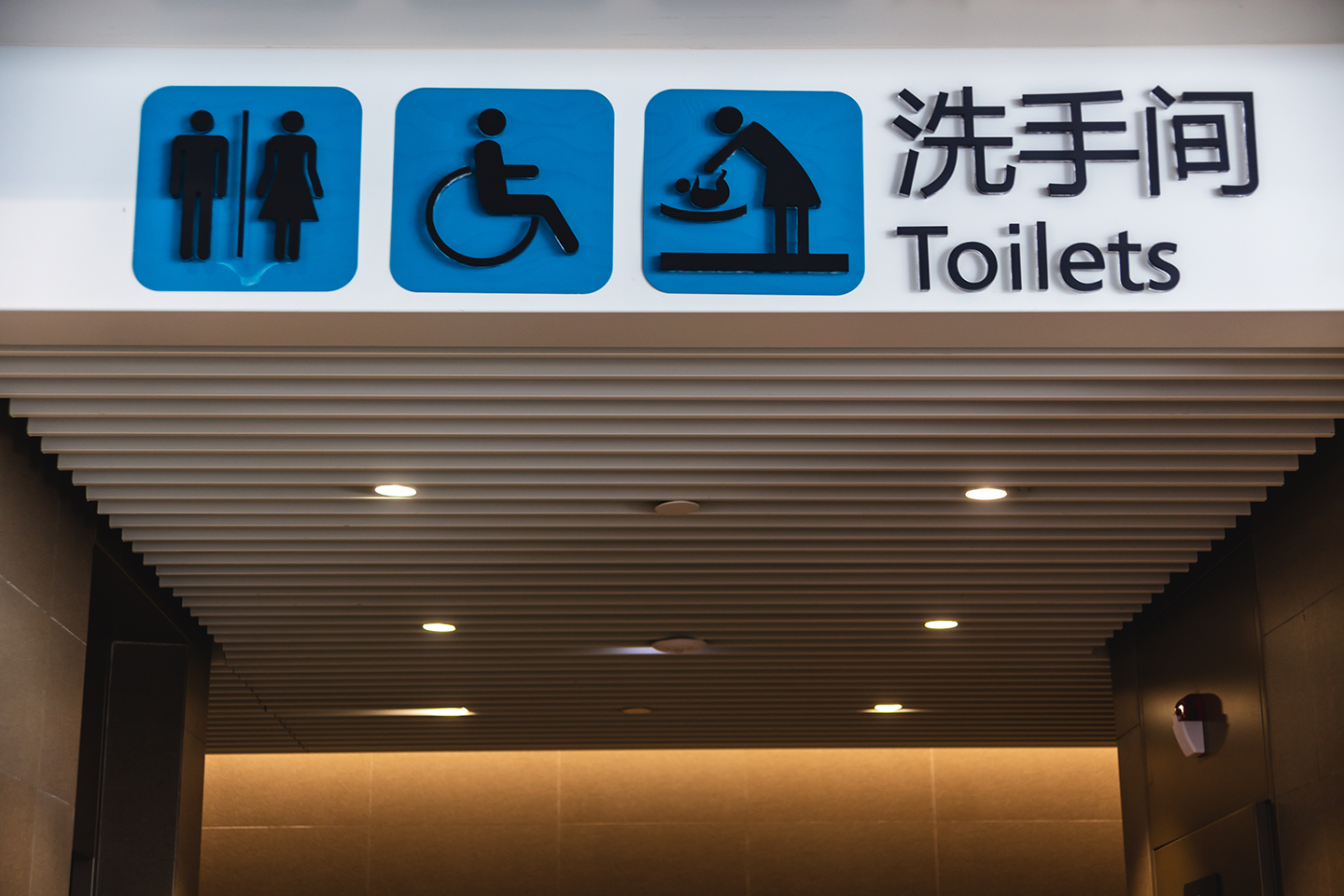
- Clear, well-placed signage that uses recognised symbols or pictograms helps people with reading or cognitive difficulties, and those whose first language is not English.
Sometimes one solution will not suit all and a range of options will need to be provided. For example:
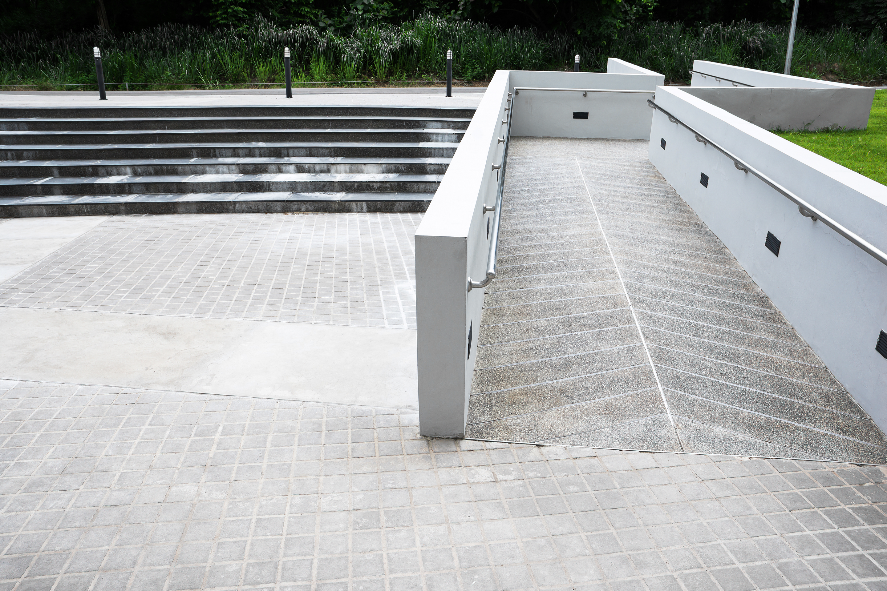
- Providing both steps and a ramp where there is a change in level.
- Providing parking ticket machines that offer slots at different heights to facilitate use at standing height, sitting height, and by people of small stature.
Those who commission, design, construct or manage any part of the built and made environment also have a duty of care to adhere to relevant legislation and regulations including equality legislation, building regulations and health and safety regulations.
Ensuring accessibility for all
To ensure compliance (and safe accessibility for all), building and facility managers should get an expert to audit the building’s accessibility at least every three years. The periodic consultation would provide prioritised advice about accessibility problems in the building and practical advice on how to address them. A good accessibility expert will often be able to suggest affordable solutions as well as an implementation plan for addressing each issue.
One step at a time
The National Disability Authority’s Access Handbook Template defines an Access Handbook as an internal document for the use of management, maintenance personnel and new staff; and which all staff should be aware of. It says the purpose of an access handbook is to provide a simple way of listing and explaining the features and facilities of a building, which must be maintained and/or improved in order to ensure access for everyone.
Develop an access handbook that includes:
- Background information on accessibility.
- How to get to the building, including information about local public transport and its accessibility.
- Information about accessible facilities, such as:
- Lifts.
- Accessible toilets.
- Accessible parking spaces.
- Guidelines for accessible signage.
- Management responsibilities.
- A maintenance audit template, and
- Evacuation plan for emergencies.
Staff who work in the relevant areas should refer to—and update—the access handbook while working.
Maintaining accessibility in buildings
Make sure that parking spaces for people with disabilities are accessible. Check:
- That parking spaces and drop-off points are kept clear for people who need them.
- The surface and lighting around the building and on the paths that customers use to get to the building, and
- That the main entrance door is correctly designed, and that at least one entrance is accessible if the main entrance is not accessible.
Ramps and steps
If any public service areas have slopes that are steeper than 1:20, ensure that both steps and ramps are available, and that they are correctly designed.
Lifts
- Provide accessible lifts in all new buildings that have more than one floor.
- Make sure that the lifts are designed to best practice guidelines.
- Check the lifts’ operation regularly, and
- Keep the lifts clear.
Check that:
Corridors and doors
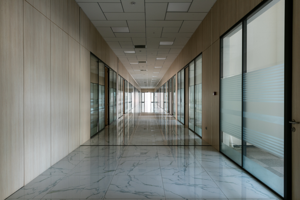
- Corridors and routes are not obstructed by deliveries, machinery, or anything else.
- Doors are kept open where possible.
- Doors that are closed are easy for customers to open, and
- Doors are wide enough for all customers.
Signage
Public buildings should have signs to let residents and/ or customers understand where they need to go. The signs should:
- Be designed according to best practice guidelines.
- Have Braille or raised lettering wherever possible.
- Have writing that is large enough for people to read.
- Use appropriate symbols.
- Not be ”home made“, and
- Be placed where your customers will be able to see them easily and not walk into them.
Reception areas and waiting rooms
Public service reception areas and waiting rooms should be designed and maintained to best practice guidance.
- Provide correctly designed seats. A mixture of types and sizes of seats is best. Some customers may need to use armrests, and some may find arm-rests awkward.
- Provide an induction loop system in at least one accessible meeting room.
Intercoms, queuing systems, ticket offices, information desks
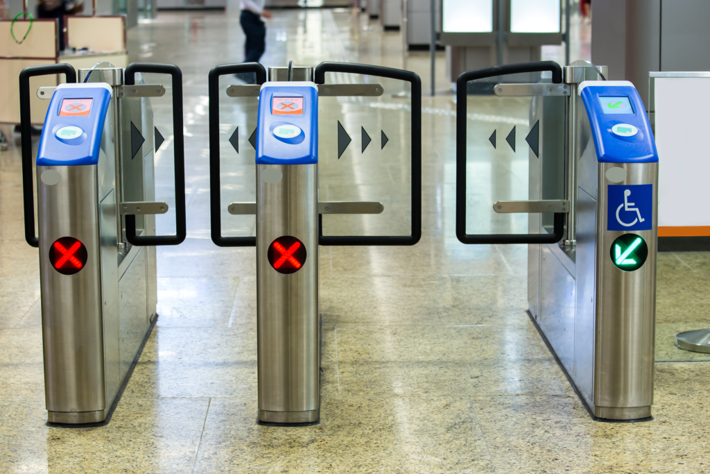
Managers need to consider how they will inform customers that they are next in line. Remember that some customers might not be able to:
- Read visual information or hear audio information or intercoms.
- Reach tickets or intercoms that are very high, very low, or awkward to reach, or
- Understand complicated language or jargon.
Plan the location, output, and language of your intercoms, queuing systems, ticket offices, or information desks carefully.
Toilets
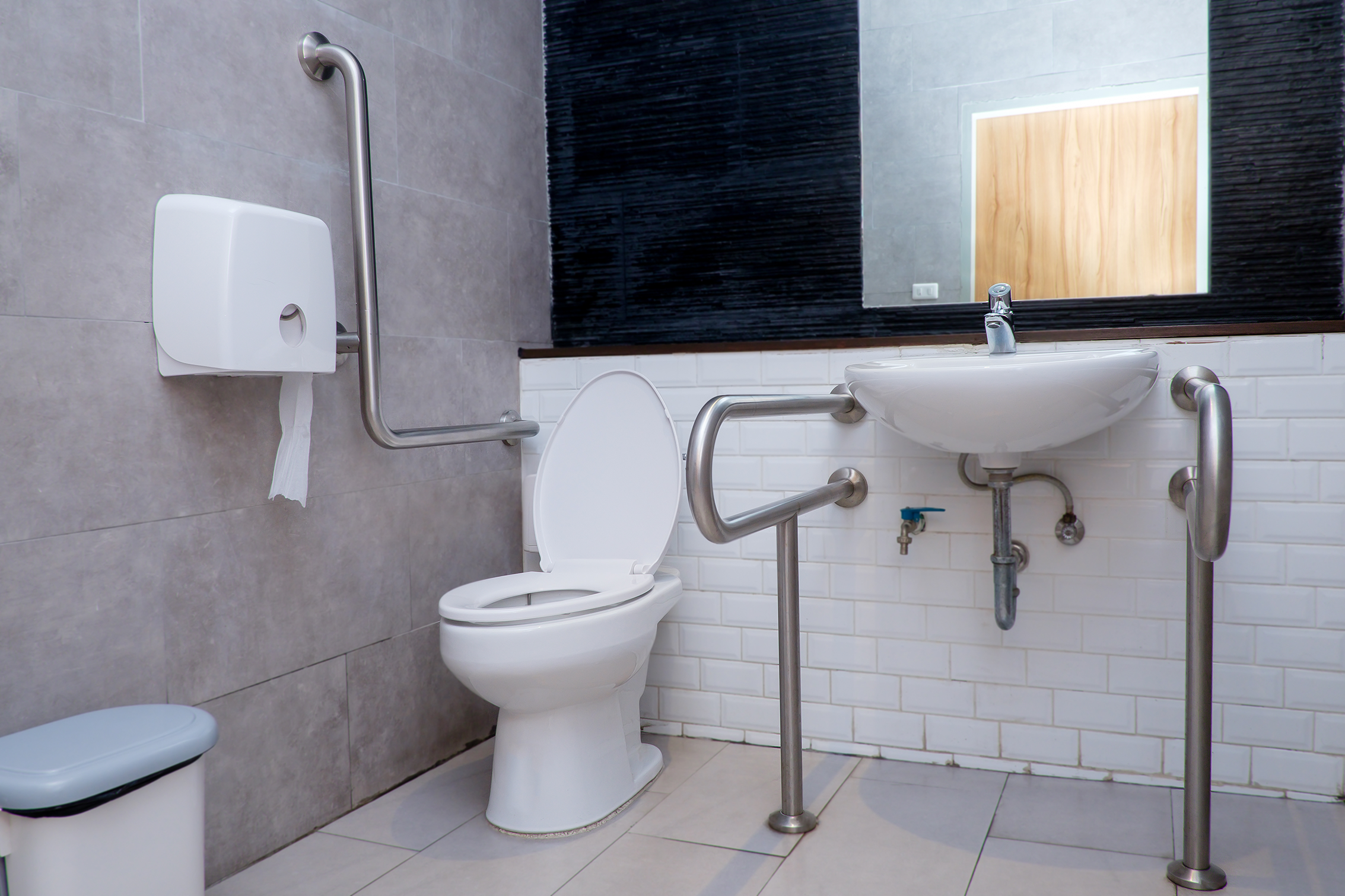
- If restrooms are provided for the public, provide toilets that customers with disabilities can use. Follow best practice guidance carefully.
- Provide an alarm system in your accessible toilets and test it regularly to make sure that a member of staff will help somebody in an emergency.
- Make sure that accessible toilets are not used for storing cleaning equipment, deliveries, or anything else, and
- Provide sanitary bins in accessible toilets and put them where they will not obstruct wheelchair users.
Interior design
Lighting
The light in all building common areas should be distributed evenly. There should be no large variations in lighting levels and the light should not be too bright or too dark. Avoid glossy, shiny and polished surface finishes and keep reflections, shadows, and glare to a minimum.
Visual contrast
Use differences in colour and colour intensity to create visual contrast. That will help customers with vision impairments to:
- Distinguish between walls and floors.
- Distinguish between door backgrounds and fittings.
- Avoid hazards and help them find their way around the building.

